Behind the interior design of a glamorous South Beach Residences retreat
Singapore-based interior designer Elliot James Barratt gives Boulevard the inside story on a sophisticated sanctuary in South Beach Residences, complete with whiskey library and covetable walk-in wardrobe for two serious collectors.
Interiors lovers with a discerning eye and an affinity for art are no stranger to Elliot’s work. Here, the award-winning founder of Elliot James Interiors, which is renowned for bespoke furniture and lighting, talks us through one of his latest accomplishments: a haven for a couple in South Beach Residences that’s rich in style and escapism.
Video and photography by Boulevard
Boulevard: We’ve seen from your previous projects that you go the extra mile to bring the homeowners’ passions to life in their surroundings. Can you share the inside story on this home?
Elliot James Barratt: Going the extra mile often means removing any ego from a project. The finished article must represent the client and their passions and personality traits throughout and not our own style preferences. That is why you’ll see throughout our broad range of projects, no two ever look the same. We obviously help steer between tasteful and beautiful, but we ultimately take our clients’ dreams and make them a reality that work harmoniously throughout the interiors.
For this project, the clients are a very glamorous couple who appreciate the fine details, fabrics and finishes. It was our job to create a calm, warm environment that could show a level of finish and inject areas of fun, glamour and sophistication; a space that can be formal but at the same time incredibly inviting and welcoming.
The whiskey library is such a personalised touch. What was the brief and how did you take it beyond imagination?
Upon appointment, we always spend a great deal of time with our clients, understand their needs and wants and what they like to do in their spare time. Do they collect art, wine, watches, whiskey? On this occasion the client expressed his love for whiskey so we immediately wanted to create a personal space for him and his collection that would also work with the rest of the entertainment space.
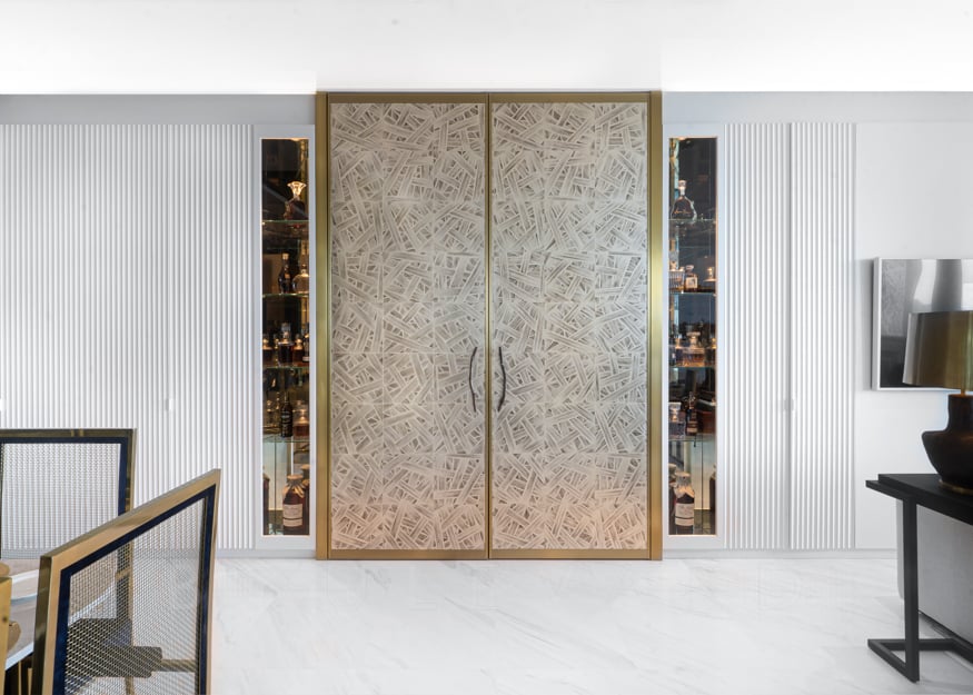
The brief was to maximise the space throughout, use every possible square foot and there was a window ledge with a huge window that looked on to a solid wall; as soon as I entered the apartment I knew we had to make better use of this space.
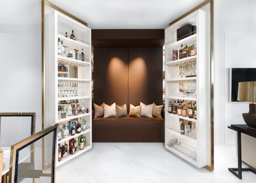
My team and I fell in love with the idea of having two large doors that could lead somewhere special. They look as though they should open onto another grand room or similar, but in my opinion, they open into something far more interesting. We upholstered the seat in a burgundy saddle leather, we have speakers in the ceiling and light sensors to add to the atmosphere. Now the clients can sit and enjoy the aromas of leather, cigars, whiskey and take in the cool jazz music under their atmospheric lighting.
What are the more subtle details in this home that you created to give the homeowners that extra bit of pleasure?
For us the fun is in the subtleties. We love to watch people sit in a space for the first time and continually discover new details. For this one we commissioned bespoke door handles with a very special pattern on them that has a personal connection with the family.
We commissioned a crystal waterfall lighting installation in collaboration with Swarovski that again has a personal story about how our clients met.
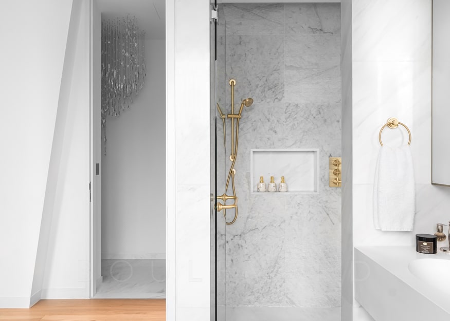
Every space, every drawer, every storage configuration is created to make our clients’ lives easier and that little bit more enjoyable. We spend hours understanding how our clients use a certain area so we can ensure everything is positioned within reach and functions in a way that is intuitive to the way they live and use their environment.
We’re drawn to the subtle variety of patterns and textures throughout — what brings it all together for you?
The Elliot James core style is “Less is more” and making our interiors as timeless as possible. We like to give key features room to breathe, so we’ll generally design with a muted and clean palette then add the textures, injection of colour or interesting form into the foreground. Very much like a painting, it consists of layers.
We have our base layers that are calm, subtle, simplistic in form, then we begin to layer with more detail such as the hand painted wallpapers, brass detailing, fluted glass and then finally we add the statement pieces such as the chandelier, the brass table lamps, the gold and velvet dining chairs.
We get a peek of the kitchen — what were the clients’ must-haves in this space, and can you share your favourite elements in this zone?
Initially the kitchen was made up of a very bland island where the dining table now is. Then there was a very dark and narrow wet kitchen. So we removed what was a helper’s room and bathroom and took down the walls between the two kitchens, which allowed us to push the kitchen back.
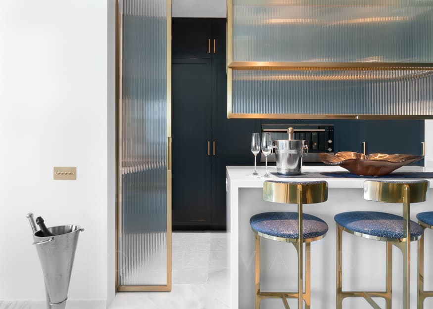
The client is an amazing cook and loves to bake and create amazing cuisines, so it was important for her to have the necessary space and appliances to do this. It was also important to be able to close off this area when entertaining, so I am particularly proud of the sliding fluted glass panels that turn this open-plan kitchen into a private space. The diffused light still comes through, giving the impression of space but dirty dishes or glasses can’t be seen.
The colour is also an element I am immensely proud of. We changed the shade of blue twice to get it just perfect and the contrast against the white and brass is just incredible.
The colour palettes in the dining and living zones are particularly striking. How did you arrive at these combinations?
We wanted to keep the core of the apartment light and simplistic, but we love to create contrast. In this design, black would have been too harsh and a dark blue would set off the brass and golds beautifully. The blue we finally settled on was particularly rich and again the contrast between the matt of the paint and the reflections of the brass, gold and glass complemented each other perfectly.
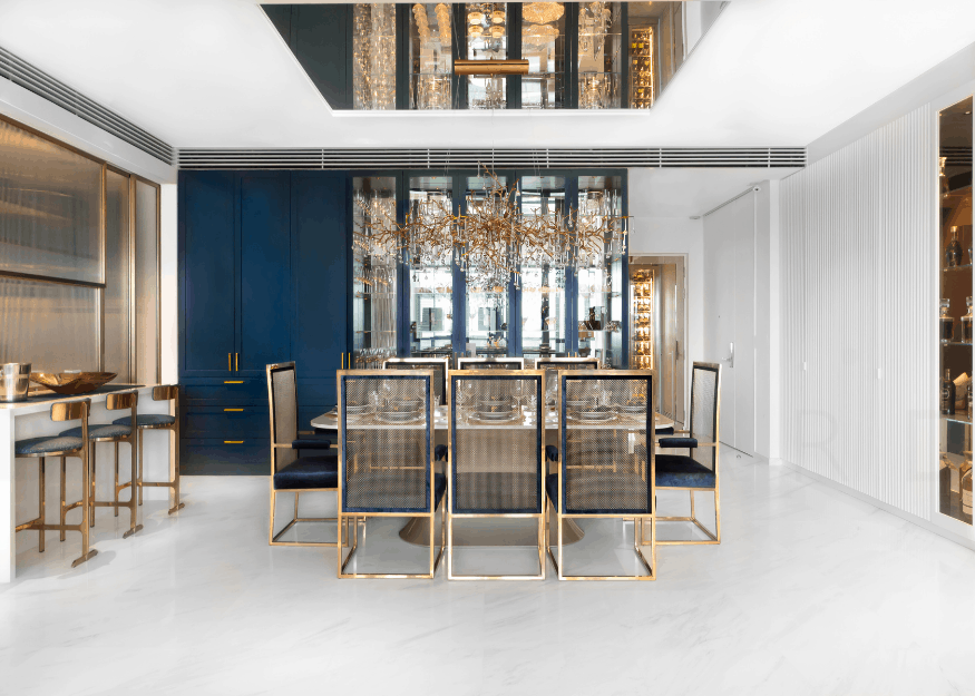
We also can’t keep our eyes off the sculptural lighting above the dining table…
The lighting is from a company here in Singapore called Serip. We wanted to form a canopy above the dining table as a showpiece, but also create a sense of intimacy for dinners and parties. With so many straight lines and white elements we wanted to create something more fluid to break up the space. With the random configuration of the chandelier, it also works so well when reflected in the mirrored ceiling panel above.
There is striking symmetry in the living and dining zones: do you have any rules for structuring a living space?
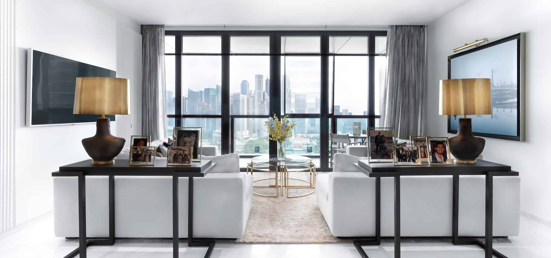
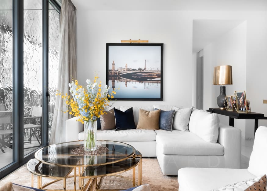
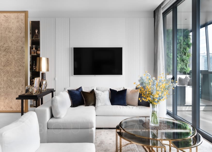
For this space we looked at the most important features and in this case it was the view. We tried to maximise the view from wherever one is sitting. We created an area to watch television on one side of the two L-shaped sofas… but the TV was not the priority. When looking at the space, you can clearly see how the intimate sofa area faces the Singapore skyline.
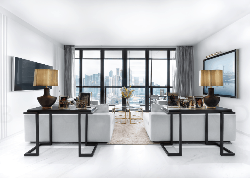
Balance and symmetry is extremely important to us when trying to create a relaxing environment.
The bedroom is dreamy — one can imagine an entirely different atmosphere for unwinding in the evening and waking up to. What informed the creation of this space?
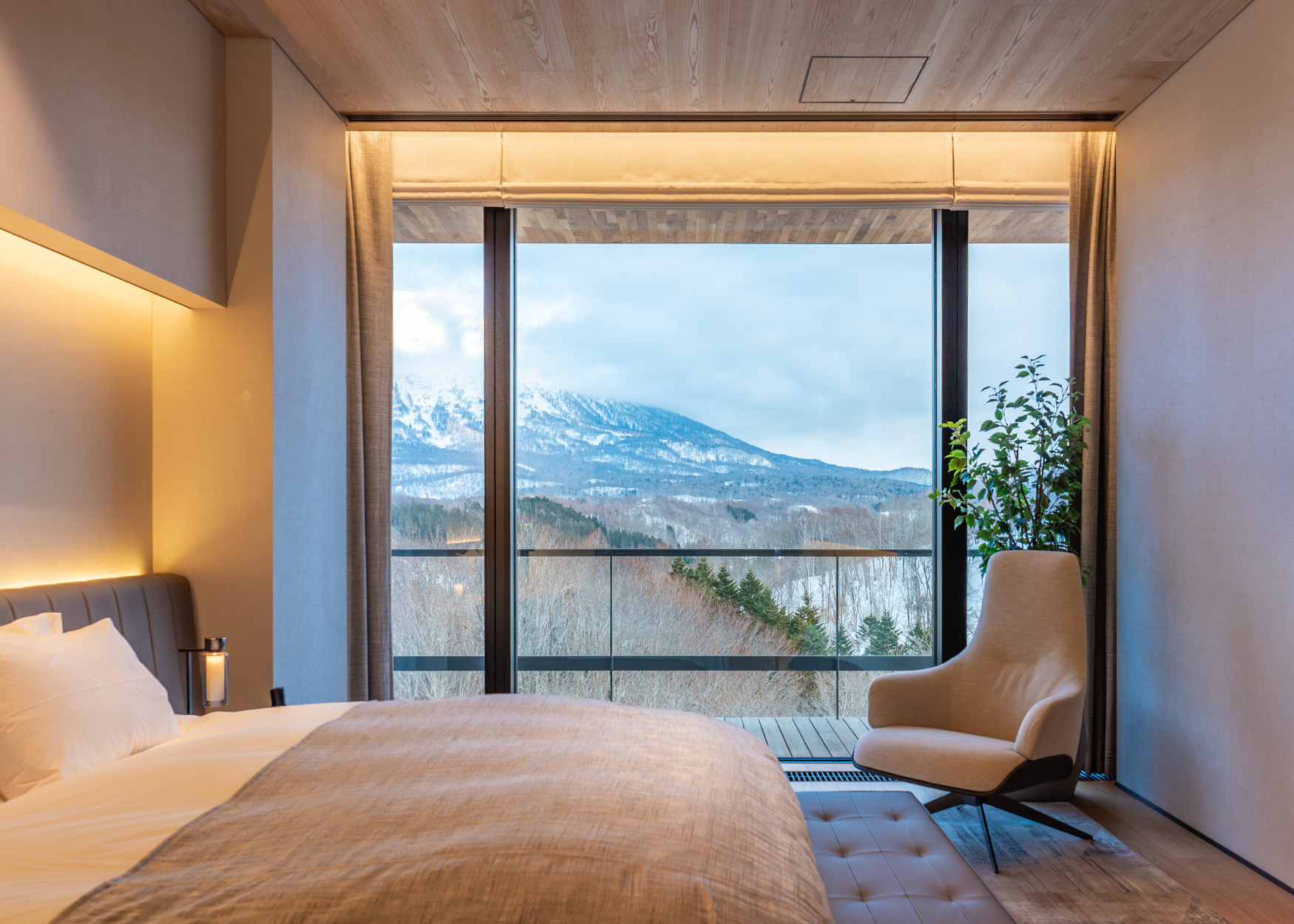
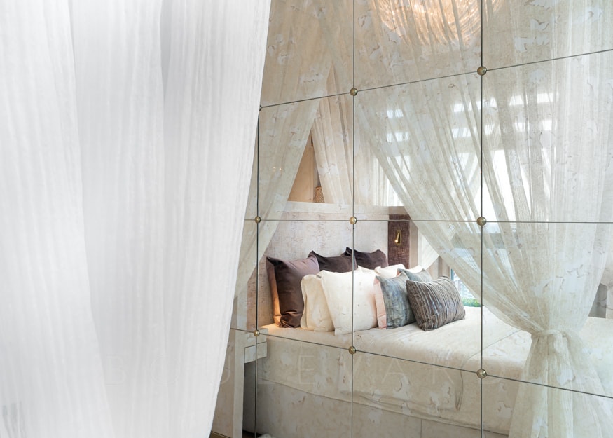
For the master bedroom, we wanted the clients to feel like a king and queen in a truly impressive bed that is intimate, cosy and romantic. With incredible views over the Pedang and overlooking Raffles Hotel to the right, we knew we couldn’t obstruct one of the views by placing the bed against one of these windows or walls so we created a ‘floating’ bed. We enclosed the bed with the canopy and sheers to give that sense of intimacy and grandeur.
Tell us more about the bathroom, and about those beautiful light fixtures — what was the theme for this space?
The original layout and finish was in no way grand or glamorous enough for a master bathroom suite. The door to the bedroom was further to the left and a small useless cupboard was in place. By removing this it became instantly apparent we could cater for a large square walk-in shower.
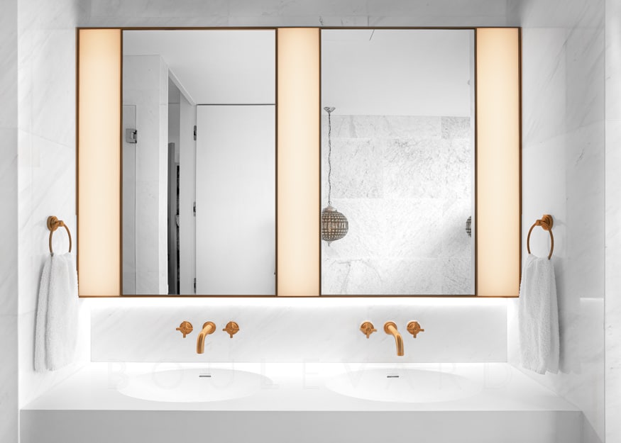
Again, we wanted this space to be beautiful but relaxing. We designed a bespoke sink unit with Claybrook Marble, we chose a textured marble tile for the walls and then set the bathroom off with matt brass taps and fixtures by Samuel Heath and pendant light fixtures by Eichholtz. We create bespoke vanity lights and under counter LED lighting.
We hear the client cried happy tears when her walk-in wardrobe was unveiled. How were you pushed creatively, and can you share some of the special features you conceived for what we can all guess is a fabulous personal collection?
We wanted to create a space completely tailored to her dreams for her walk-in wardrobe. We designed features such as rotating shoe storage, foldable mirrors so one can see themselves from all angles and a corner display cabinet for that stunning dress.
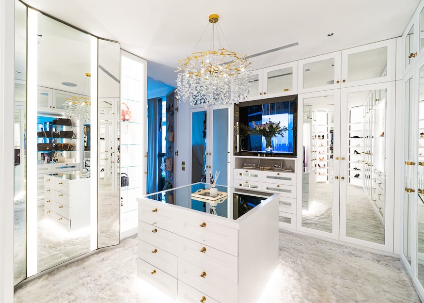
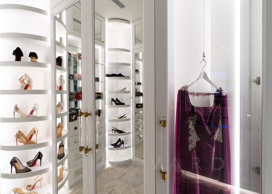
There is actually very little in this apartment that wasn’t a bespoke creation by us. We were pushed in many areas to make such strong ideas work harmoniously together and to ensure that certain finishes worked well with fabrics we paired them with. We had never created an enclosed bed with sheers before. We were challenged in the kitchen with the proportions, to try and include so much, but ensure it didn’t look cramped or too busy.
Which feature, for you, set the tone for the rest of this home?
I think it has to be the kitchen and dining room for me. We included so many features and uses and it is such a vital part of the house, and I am so pleased with how it came out. It functions superbly. It merges the kitchen with the dining room so well, and the colours, finishes and materials reflect the Elliot James core simplicity, but is beautifully paired with some of the most glamorous features we’ve ever created or specified.
Go further with Elliot James Interiors.
Where to now?
- Further inside: Interior design firms in Singapore you need to know
- Step outside: Architects who are reshaping Singapore
First published June 2021.
